SIGN UP

CASE STUDY

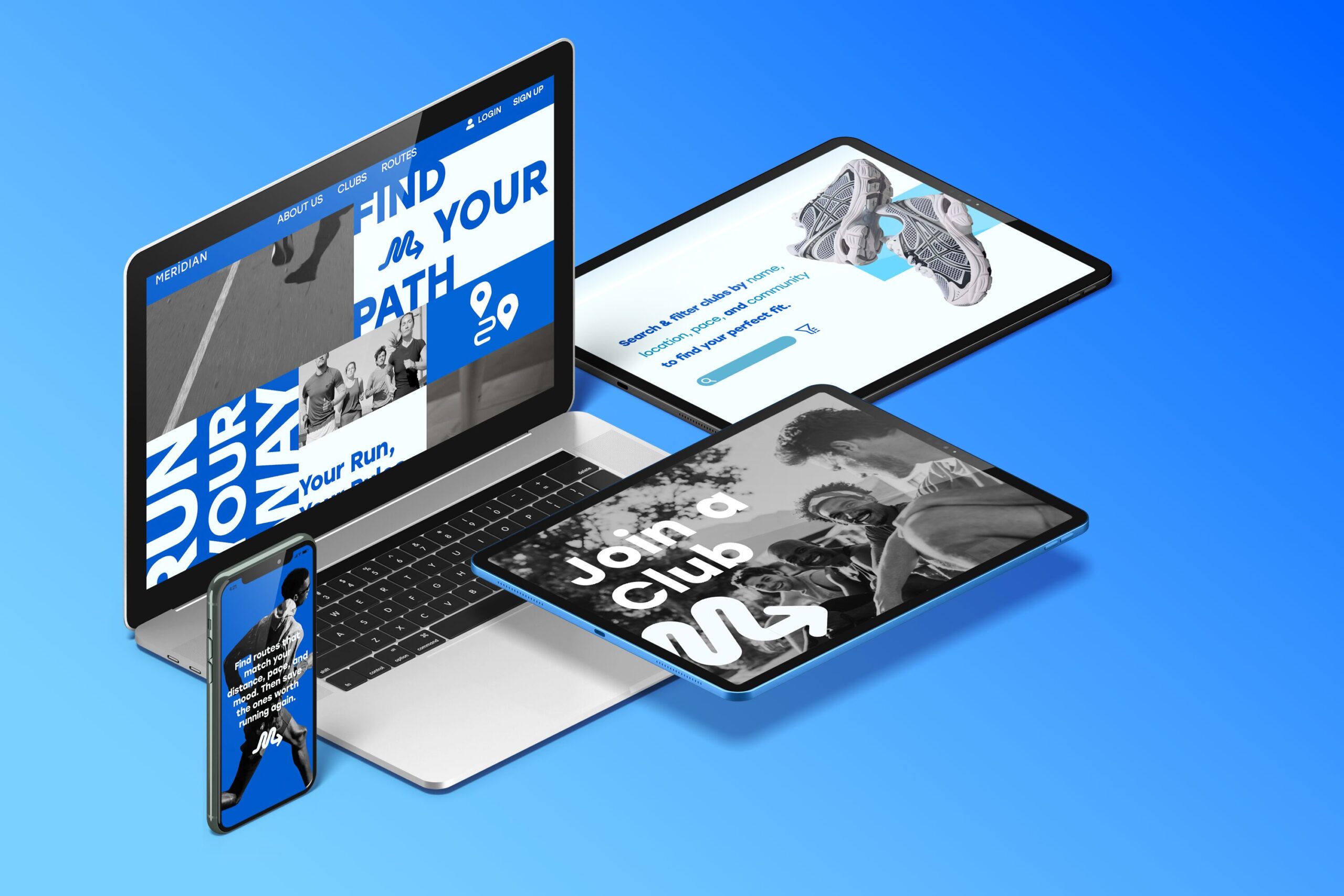
Your Run, Your Rules.
Meridian is a running app created to allow runners control their routes, avoid certain areas, remix popular paths, and adjust distances easily, all while sharing their routes and runs with the community. Meridian helps make running feel safer, more flexible, and more enjoyable. 

This project is an expansion of the App Design project from our 3300 Interactive II class. That project consisted of us creating and designing our app from scratch. We really had to hone in on a unique feature that would make our app stand out in a sea of similar apps, and create a design that reflects our idea, and makes it useful and user-friendly. 
Gathering
content

Before starting the design for the website, I focused on collecting all the content needed for each page, and organizing in into the following: 

Home content

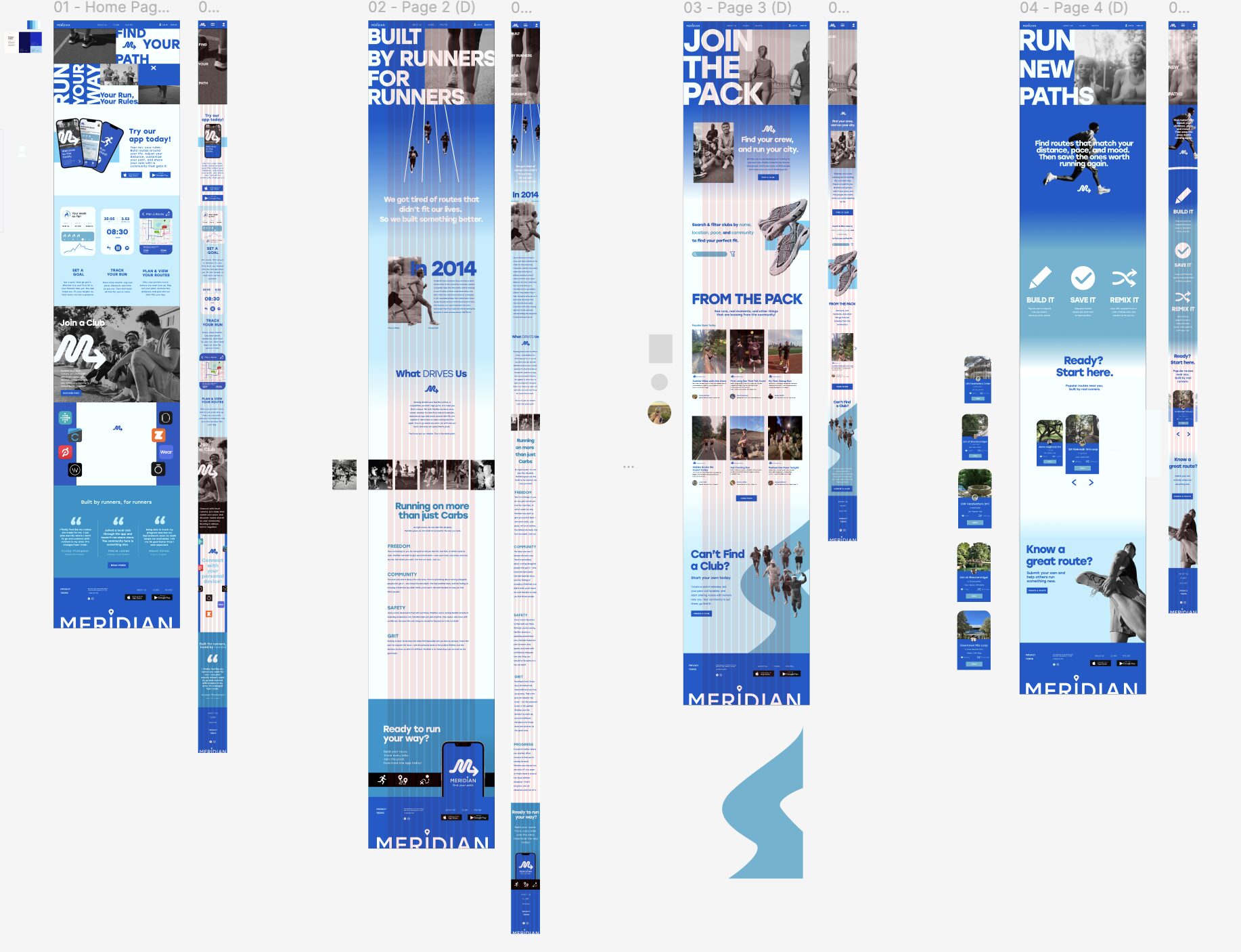
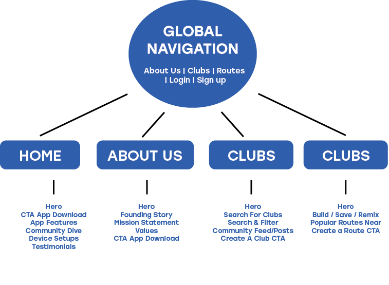
Starts by introducing Meridian as a running app built around personal freedom and community. Features a hero section with the tagline “Find Your Path / Run Your Way,” app download links, a breakdown of the three core features (Goal Setting, Run Tracking, Route Planning), a community club section, a wearable device integrations section, user testimonials, and a footer with nav and contact info.

about content

Shares the story and mission behind Meridian. This section features the founding story rooted in 2014. A mission section, and a values breakdown covering Freedom, Community, Safety, Grit, and Progress. Closes with an app download CTA.

CLUBS content

This page encourages users to find and join local running clubs. Showcases a club search and filter section, a community feed showing real runs and stories from members, and a “Can’t Find a Club?” section prompting users to create their own.

ROUTES content

Helps users discover and share running routes. Showing a three-step section on how to Build It, Save It, Remix It. Another section showcasing a popular routes feed with community-submitted runs, and a “Know a Great Route?” section prompting users to submit their own.

site map

To better organize the content, setting up a site map was the next move to better understand and format all the information needed for the website.

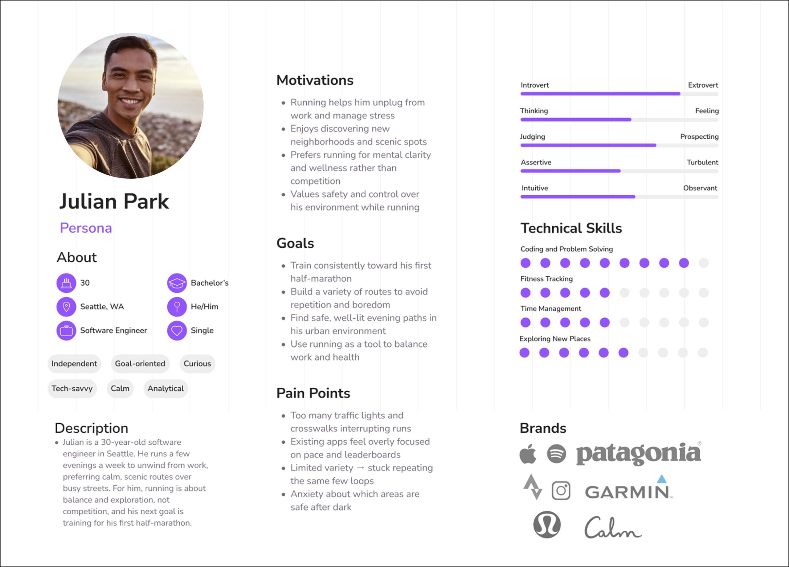
PERSONA

Following a flow chart, a persona was created to better understand who would sue this site and who the website was based off of, and what they expect from what they already use. 

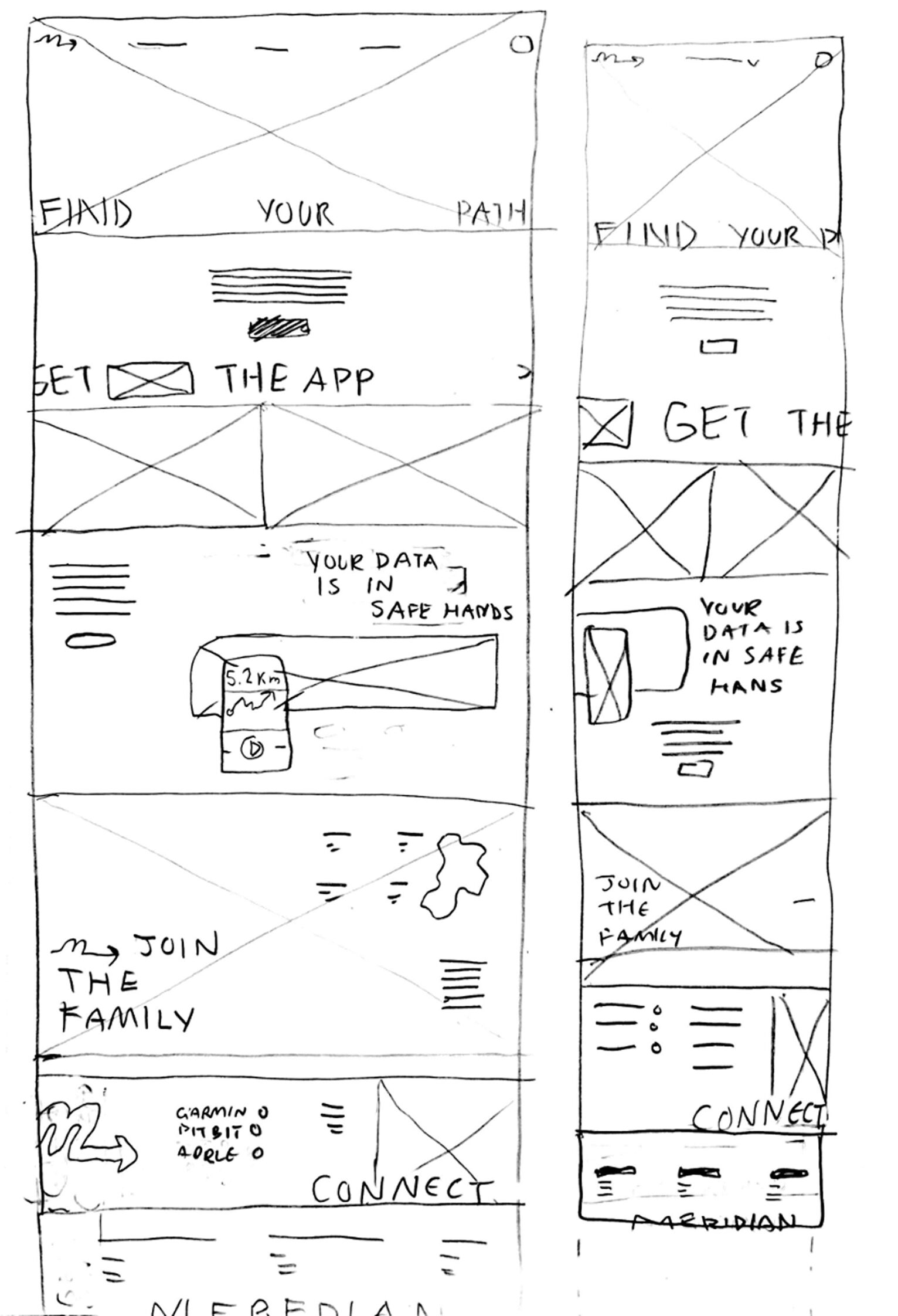
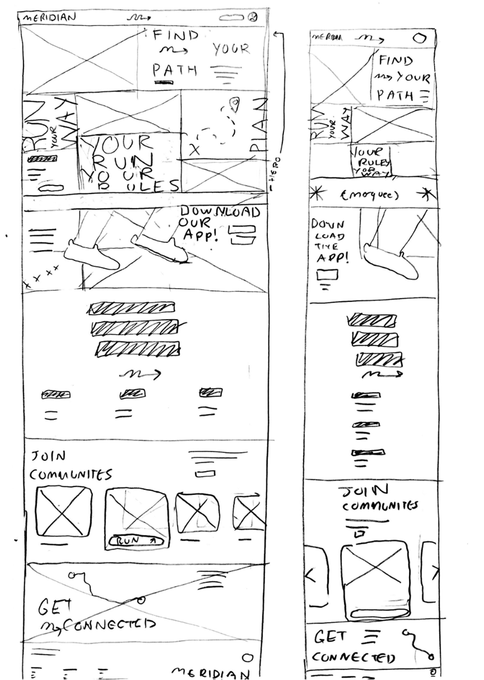
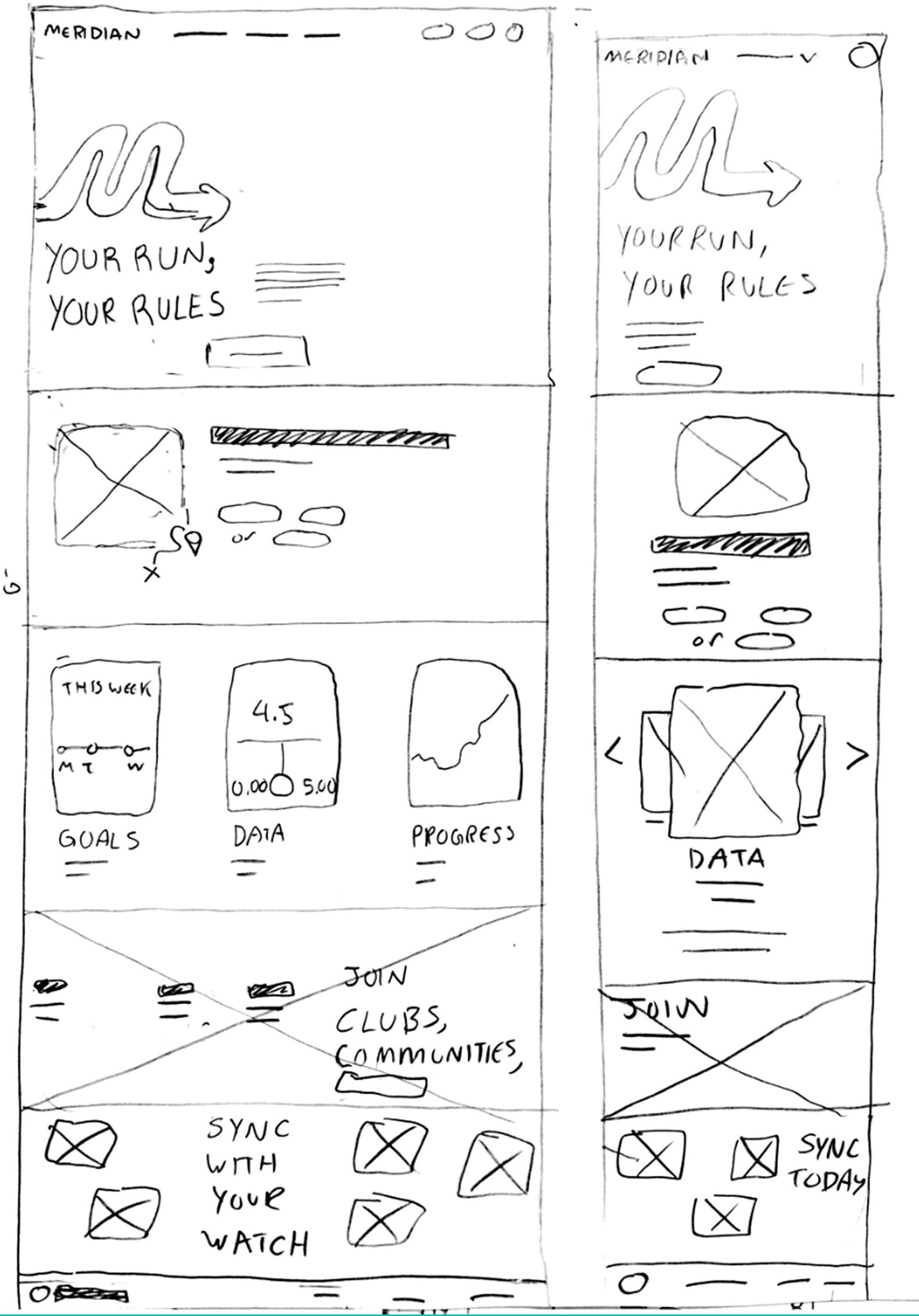
Wireframes
&prototype

Paper wireframes were created for each page to establish a good sense of layout and content hierarchy. Soon, these ideas were turned into a clickable prototype to simulate user navigation and flow.  

Conclusion
& results

This website pushed me in two ways. It helped me get comfortable with WordPress as a new design work force outside of coding. Another was that it challenged me to build each page with the idea that a well-crafted website can be a powerful tool for selling a product, and both are takeaways I’ll carry into my future work.